Master the Cursive Alphabet: Fix Slant, Spacing & Sizing for Beautiful Handwriting
Struggling with your cursive? You've diligently practiced the letters, but something still feels amiss. Perhaps your slant is inconsistent, spacing is uneven, or letter sizes are wobbly. These are common challenges, but they don't have to hinder your journey to beautiful penmanship! This guide is your personal "Cursive Clinic," designed to help you diagnose these frequent handwriting woes and provide clear, targeted solutions. We'll show you how to improve cursive handwriting and finally achieve the elegant, readable script you've been working so hard for. Wondering how to quickly learn cursive when these details feel overwhelming? Let's dive in and fix them together!
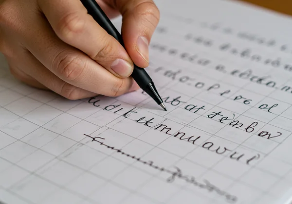
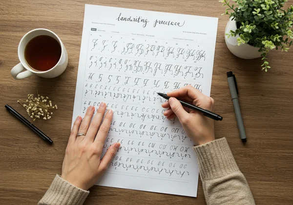
Ready to start your journey? You can find all the resources you need with our free practice sheets.
Mastering Consistent Cursive Slant: Improve Your Cursive Writing
A uniform slant is the backbone of graceful cursive. It’s the visual rhythm that ties your words together, creating a professional and polished look. When your slant is inconsistent—some letters standing straight while others lean—it disrupts the flow and makes your writing appear disjointed and difficult to read. Achieving a steady slant is one of the most impactful changes you can make.
Why Consistent Cursive Slant is Key to Beautiful Cursive Alphabet Writing
Think of a consistent slant as the frame of a house. It provides structure and stability. In cursive, this forward tilt (typically around 52-55 degrees for right-handers) guides the eye smoothly across the page. It creates a sense of motion and connection, which is the very essence of cursive writing. Without it, the individual letters fail to form a cohesive whole, undermining the elegance you're trying to achieve. Beautiful script relies on this foundational consistency.
Diagnosing Your Slant: Is It Too Vertical or Leaning Too Much?
Before you can fix the problem, you need to identify it. Take a piece of paper and write a few sentences naturally. Now, examine your letters. Do they stand straight up like soldiers (vertical slant)? Do they lean so far forward they look like they’re about to fall over (excessive slant)? Or, most commonly, do they vary wildly from one letter to the next? Use a protractor or a slanted guideline sheet to check. The goal isn't a perfect, machine-like angle on every letter, but a general, harmonious lean across the entire text.
Targeted Drills to Achieve Your Ideal Cursive Angle
Once you’ve diagnosed your slant, it’s time for targeted practice. The key is to train your hand and eye to recognize and produce the correct angle consistently.
- Slanted Guideline Drills: The most effective method is to practice on paper with pre-printed slant lines. You can easily find these online or create your own. Focus on making the main downstrokes of letters like 'l', 't', 'h', and 'd' parallel to these guidelines.
- Push-Pull Strokes: Fill a line with simple up-and-down strokes, all leaning at your desired angle (/////). This builds muscle memory for the slant without the complexity of forming full letters.
- Connecting 'i' and 'u': Practice writing strings of "iiii" and "uuuu". These simple letters force you to focus on maintaining a consistent slant across multiple connections, which is crucial for building a steady cursive angle.
Achieving Perfect Cursive Letter Spacing for Legible Cursive Alphabet
If slant is the structure, spacing is the breathability of your cursive. Proper spacing between letters and words ensures your writing is legible and aesthetically pleasing. When letters are crammed too tightly or spread too far apart, the natural rhythm is lost, making the text a chore to read. Perfecting your spacing will instantly elevate your penmanship.
The Impact of Uneven Spacing on Cursive Flow and Readability
Cursive writing is all about flow. The connections between letters should be smooth and natural, creating a seamless visual path. Uneven spacing breaks this path. Tightly packed letters can merge into an indecipherable blob, while excessive gaps create jarring stops and starts. Good spacing enhances readability by giving each letter and word its own defined space while maintaining the elegant connections that define the script.
Identifying & Correcting Tight or Wide Cursive Gaps
Look at your writing sample again. Are the loops of letters like 'o' and 'a' consistently round and open, or do they sometimes get squished? The space inside these letters should be roughly the same. Next, look at the space between letters. A good rule of thumb is that the space between letters in a word should be narrower than the space between words. A common mistake is making connecting strokes too long or too short. Identify words where the letters feel either claustrophobic or disconnected.
Practice Techniques for Balanced Word & Letter Connections
Correcting spacing issues involves focusing on the entry and exit strokes of each letter. These are the little lines that link letters together.
- The 'o' Connection Drill: Practice writing words with the letter 'o', like "on," "of," "look," and "good." The exit stroke from the 'o' should be a gentle, upward curve that naturally leads into the next letter without creating a large gap.
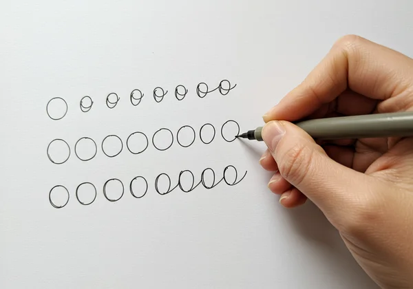
- Circular Motion Practice: Make a line of connected circles (ooooo) without lifting your pen. Try to keep the size of the circles and the space between them uniform. This drill masters the fundamental motion for many letter connections.
- Word Spacing Check: A simple trick for word spacing is to ensure you can fit a lowercase 'o' between each word. Practice writing sentences and consciously leaving this amount of space. You can find excellent cursive alphabet chart resources to guide your letter forms.
Ensuring Uniform Cursive Letter Sizing for Your Cursive Alphabet
Consistent letter sizing is the final piece of the puzzle. It brings order and harmony to your writing. Cursive letters have three distinct zones: the baseline (for letters like 'a', 'c', 'm'), the ascender line (for 'b', 'd', 'h'), and the descender line (for 'g', 'j', 'y'). Maintaining consistent heights within these zones is critical for clean, professional-looking cursive.
Why Uniform Sizing Elevates Your Cursive's Visual Appeal
Uniformity creates a predictable and pleasing visual pattern. When your 't's and 'h's are the same height, and your 'p's and 'q's descend to the same depth, your writing looks intentional and controlled. It demonstrates mastery and care. Inconsistent sizing, on the other hand, makes writing look chaotic and juvenile, no matter how well-formed the individual letters are.
Common Sizing Mistakes: From Overly Tall Loops to Tiny Miniscules
Scan your writing for common sizing errors. Are your ascenders on 'l' and 'h' reaching the same height? Do the descender loops on 'g' and 'y' have a similar length? A frequent issue is "shrinking miniscules," where letters in the middle of a word (like the 'u' and 'a' in 'guard') become progressively smaller. Another is making loops on letters like 'b' and 'f' disproportionately large compared to the body of the letter.
Cursive Alphabet Exercises for Proportional Letter Heights
The best way to fix sizing is to practice on lined paper that clearly marks all three zones (baseline, midline, and topline).
- Zone-Specific Drills: Dedicate practice sessions to each zone. Write lines of letters that stay on the baseline ('aceimnorsuvwxz'). Then, practice ascenders ('bdfhklt') ensuring they touch the top line. Finally, work on descenders ('gjpqyz') making sure they reach the bottom line consistently.
- The "minimum" Drill: The word "minimum" is an excellent tool for practicing consistent baseline letters. All letters should be the same height and width, forcing you to focus on uniformity.
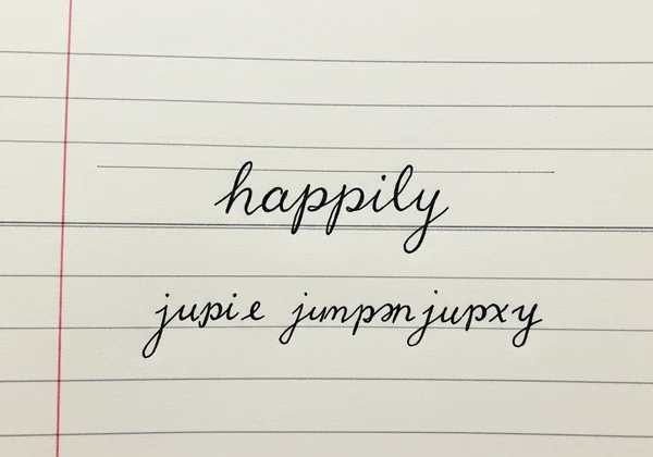
- Comparative Practice: Write words that contain letters from all three zones, like "happily" or "jumping." This forces you to transition between different heights while maintaining proportion. These cursive practice drills are invaluable.
Your Path to Lasting Cursive Improvement
Fixing slant, spacing, and sizing isn't a one-time fix; it's about building good habits through consistent, mindful practice. Integrating these troubleshooting techniques into your regular routine will transform your handwriting from inconsistent to impressive. Lasting improvement is a journey of small, daily steps.
Incorporating Daily Cursive Practice Routines
Consistency is more important than intensity. A dedicated 10-15 minutes of practice each day will yield far better results than a single two-hour session once a week. Use this time to focus on one specific issue identified in this guide. One day, focus solely on slant using guideline drills. The next, work on spacing with connection exercises. A focused daily routine builds muscle memory effectively.
Utilizing Cursive Alphabet's Free Worksheets for Targeted Drills
You don't have to create your practice materials from scratch. Our platform, Cursive Alphabet, offers a comprehensive library of free resources designed for targeted improvement. Whether you need a specific letter worksheet to perfect your 'f', a lined guide to control your sizing, or a full cursive alphabet worksheet, we have you covered. These tools are designed to support the drills mentioned here and accelerate your progress. Get started and practice your letters today.
The Power of Mindful Practice and Patience
Finally, be patient with yourself. Learning a physical skill like cursive writing takes time. Don't just go through the motions; engage in mindful practice. Pay close attention to the feel of the pen on the paper, the movement of your hand, and the shapes you are creating. Celebrate small victories—a perfectly formed word, a line with consistent slant. This patient and observant approach will make the process more enjoyable and the results more permanent.
Ready to Master Your Cursive? Your Next Steps
Don't let common hurdles like inconsistent slant, spacing, or sizing derail your cursive journey! By understanding why these elements are crucial, diagnosing your specific issues, and diligently applying the targeted drills from this Cursive Clinic, you are well on your way to mastering beautiful, consistent handwriting. Remember, every expert was once a beginner. The key is consistent, mindful practice.
Ready to put these tips into action? Visit Cursive Alphabet today to access our full suite of free worksheets, interactive guides, and our innovative Cursive Font Generator. Transform your script today!
Frequently Asked Questions About Improving Cursive Handwriting
How can I quickly learn cursive when fixing mistakes?
While "quick" can be subjective, the fastest way to improve is through focused, targeted practice. Instead of writing random sentences, use drills that isolate your specific problem—be it slant, spacing, or sizing. Using our free cursive worksheets allows you to concentrate your effort where it's needed most, which accelerates learning far more than general practice.
What is the best way to start learning cursive if I have these problems?
If you're a beginner struggling with these issues, the best approach is to start with the fundamentals. Begin with basic strokes—upstrokes, downstrokes, loops, and curves—on lined paper to master slant and size from day one. Then, move on to individual letters before connecting them. This foundational approach prevents bad habits from forming and makes the entire process smoother.
Does practicing individual letters help improve overall cursive?
Absolutely. Practicing individual letters is essential. Each letter has a unique form, and mastering it in isolation is crucial before you can connect it smoothly to others. If your overall cursive looks messy, often the root cause is a few poorly formed letters. By using worksheets to perfect each letter of the cursive letters alphabet, you strengthen the building blocks of your handwriting, leading to significant overall improvement.