Master the Cursive Alphabet: 7 Common Mistakes & How to Fix Them
Struggling with your cursive handwriting? You're not alone. Many learners find their script clumsy or inconsistent despite diligent practice. The good news? Achieving elegant, legible cursive is within your reach. It often starts with pinpointing the common cursive mistakes that are holding you back. So, what is the best way to start learning cursive and correct these issues? It begins with understanding the fundamentals.
This guide reveals the seven most frequent errors beginners make in cursive alphabet writing and, more importantly, offers simple, effective strategies to fix them. Moreover, studies published in educational psychology journals often highlight the unique cognitive benefits of learning cursive. With targeted practice and the right resources, you can develop a beautiful, legible, and flowing handwriting style. Ready to refine your skills? Your journey to [mastering cursive] is just a few paragraphs away.
Identifying Common Cursive Writing Problems
Before you can fix the issues, you need to know what to look for. Think of this section as a diagnostic checklist for your handwriting. As you read through each point, compare it to your own writing samples. Pinpointing your specific challenges is the first and most crucial step toward improvement.
The Inconsistent Slant: Why Your Letters Lean Differently
One of the defining features of beautiful cursive is a consistent, forward slant. A common mistake is having letters that lean at different angles—some straight up, some leaning far to the right, and others somewhere in between. This inconsistency disrupts the visual flow and makes your writing look messy and disorganized. This often happens when your paper position or hand posture changes slightly as you write across the page.
Improper Letter Connections: Avoiding Gaps and Awkward Joins
Cursive is all about flow. The letters are designed to connect smoothly, allowing your pen to glide across the page. A frequent error is creating awkward joins or leaving noticeable gaps between letters. Some connections might be too sharp and angular, while others are loopy and tangled. This not only affects legibility but also defeats the purpose of cursive's efficiency, a style developed over centuries for faster writing, as detailed in Wikipedia's Cursive entry. Mastering these connections is essential for a fluid script.
Incorrect Spacing: Balancing Letters and Words
Spacing is a subtle but powerful element of legible handwriting. There are two areas where beginners often struggle: spacing between letters and spacing between words. If letters within a word are too cramped or too far apart, the word becomes difficult to decipher. Similarly, if the space between words is too small, your sentences will look like one long, jumbled string of characters. Proper spacing creates rhythm and clarity.
Uneven Baseline: Keeping Your Lines Straight and Consistent
Do your words seem to float up and down across the page? This is the classic sign of an uneven baseline. Even on unlined paper, your words should follow an invisible straight line. When letters and words drift above or below this imaginary line, the entire piece of writing appears chaotic and undisciplined. This issue often stems from inconsistent hand positioning or not moving your entire arm as you write.
Inconsistent Letter Size and Height: Achieving Uniformity
Uniformity is key to polished cursive. A common error is having inconsistent letter sizes. For example, your lowercase 'a', 'c', and 'e' should all be the same height (known as the x-height). Likewise, tall letters like 'l' and 'h' (ascenders) and letters that drop down like 'g' and 'y' (descenders) should be consistent in their respective heights and depths. When sizes vary randomly, the writing loses its professional and tidy appearance. A great way to practice this is with a [cursive alphabet printable].
Incorrect Pen Pressure: Smooth Strokes, Not Shaky Lines
The quality of your lines can make or break your cursive script. Applying too much pressure creates thick, clunky lines and can even cause ink to bleed through the paper. On the other hand, applying too little pressure results in faint, shaky, or broken lines. The ideal is a relaxed grip with consistent, light pressure that allows for smooth, confident strokes. This is a physical skill that develops with mindful practice.
Poor Letter Formation: Mastering Each Cursive Alphabet Shape
This is perhaps the most fundamental mistake of all. If the basic shapes of the individual cursive letters alphabet are incorrect, nothing else will fall into place. Many learners rush into connecting letters before they have mastered the unique loops, curves, and strokes of each one. Misforming a letter like 'b' or 'f' can make it look like another letter entirely, leading to significant legibility problems. Building a strong foundation here is non-negotiable. You can [practice each letter] on our site to build this crucial skill.
Actionable Strategies to Fix Cursive Handwriting
Now that you've identified the areas that need work, it's time for the solutions. The following strategies are practical, easy to implement, and designed to help you build good habits. Consistent application of these techniques will lead to noticeable improvement in your cursive writing.
Practicing Consistency for Better Cursive Legibility
The solution to inconsistent slants, sizes, and baselines is focused, repetitive practice. Muscle memory is your best friend when it comes to handwriting. Use lined paper with a slant guide printed on it to train your hand to maintain a consistent angle. Pay close attention to the height of your letters, ensuring they align with the lines on the paper. Slow down and focus on making each letter a perfect replica of the last.
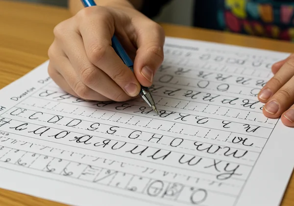
Utilizing Free Cursive Worksheets for Targeted Practice
This is the most effective way to address poor letter formation and improper connections. High-quality worksheets break down each letter into manageable strokes and provide ample space for tracing and independent practice. They are designed to help you master the fundamentals correctly from the start. We offer a comprehensive library of resources, and you can [download free worksheets] to begin targeted exercises on everything from individual letters to full sentences.
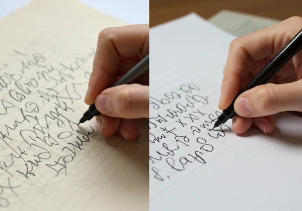
The Importance of Proper Posture & Grip for Smooth Writing
Your body's position has a huge impact on your handwriting. Sit up straight with both feet on the floor. Hold your pen with a relaxed grip—not too tight. Your non-writing hand should hold the paper steady. Importantly, use your whole arm to move the pen across the page, not just your fingers. This larger motion promotes smoother, more consistent lines and prevents hand fatigue. For deeper insights into proper pen grip and posture, resources from occupational therapy sites can be very beneficial.
Developing a Regular Practice Routine for Continued Improvement
Consistency is more important than intensity. Spending just 10-15 minutes a day practicing your cursive is far more effective than one long session per week. A short, daily routine builds muscle memory faster and keeps the correct forms fresh in your mind. Start your sessions by practicing the basic strokes and then move on to the [a to z cursive] alphabet before writing words and sentences. This structured routine will accelerate your progress.
Your Journey to Beautiful Cursive Begins Here
Unlocking your handwriting potential begins with recognizing and addressing these common cursive mistakes. Remember, every expert started as a beginner. Your path to beautiful, flowing cursive is built on patience, mindful practice, and using the right tools. Don't let initial errors discourage you; view them as opportunities for growth. With the strategies outlined here and the free, comprehensive resources available on our platform, you have everything you need to succeed. Your journey to mastering the art of cursive handwriting starts now.
We invite you to explore our platform, where you can find everything from a complete [cursive alphabet chart] to interactive exercises. [Start learning now] and watch your handwriting transform.
Frequently Asked Questions About Improving Cursive Handwriting
How quickly can I learn proper cursive handwriting?
The timeline for learning cursive varies from person to person. With consistent daily practice of about 15-20 minutes, most learners can see significant improvement in a few weeks and develop a comfortable, legible style within a few months. The key is consistency, not speed.
What's the best approach for cursive beginners to avoid common errors?
The best way to start is by focusing on the fundamentals. Begin by mastering the basic strokes (upstrokes, downstrokes, loops). Then, practice each lowercase letter individually until you can form it correctly and confidently. Use a high-quality [cursive practice sheet] from a reliable source, such as those based on established methods like the Zaner-Bloser handwriting programs, to ensure you're learning the correct formations from day one.
How do I correctly form each cursive alphabet letter to prevent mistakes?
To ensure correct formation, you must learn the proper stroke order and shape for every letter. The most effective method is to use guided resources that show you exactly how each letter is written. We offer detailed, step-by-step guides for every letter of the alphabet. You can [explore the alphabet] on our website to access free interactive lessons and printable worksheets for each character.